Riddle Fortnightly No. 11
On Goodhart's Law, better tools for presentation, the evils of PowerPoint, and another Johnnie problem.
Of September 19th, 2024
Readers of Riddle,
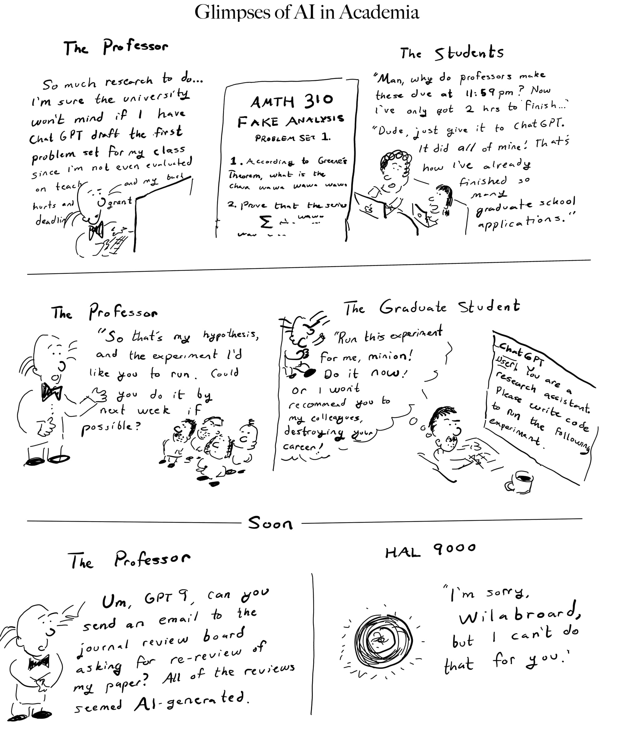
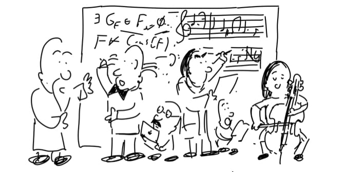
You’re probably familiar with Goodhart’s Law, that ‘once a goal becomes a metric, it ceases to be a good goal.’ This is often attributed to bureaucratic incompetence, or (more grandiosely) to the maddening difficulty of pinning down precisely what we mean by any given goal. But I’d like to gesture at an even more grandiose explanation, which might get at the heart of this comic.
If you lead a horse to water, but discover yourself incapable of making him drink, you’ve encountered the chasm between the subjective and objective. It’s every educator’s nightmare: you can lead your students to the perfect view of your material, lower their heads towards some enticing problem – but unless the student has some inner fire, a sense of what's beautiful and a passion to find it – all of the incentives in the world will fail to create anything other than a plodding mundanity.
Sometimes, a good teacher can ignite some inner curiosity and get a student to transcend all of the incentives. But sometimes the reverse happens, and even those burning with passion get mired in the incentives – and, like poor Wilabroard and his students, lose sight of what's beautiful in the narrow search for what's useful.
In today's edition, we're applying some of this logic to something you'll likely be seeing or giving in the near future – the presentation. In particular, the PowerPoint presentation, or Google Slides, or Keynote, and in general the idea that reading aloud sequences of bullet points is a good way to communicate. The Riddler will lead this philosophical brigade in our "Great Reads" column.
If you're sympathetic to the above, and on the hunt for alternatives to PowerPoint, we've got 'em in the tool corner. With them, you can craft your presentations in style, and be the envy of your peers and hero of your audience!
Bon Voyage!
Chester Snuphanuph, PhD
Thinking Tools
Apps, tools, and workflows for thinking better with technology.
The Riddler will argue below that PowerPoints are making you (and your audience) stupid – but, whether or not you buy that, the tool itself is fairly boring. It's barely changed in the last 30 years!
Here are some more modern tools for crafting presentations. Not only will their novelty surprise and delight your audience, they might just help you create the best presentation of your life.
- iA Presenter (App, Mac & Windows) - from the makers of the minimal writing app iA Writer, a beautiful application designed around a new workflow of writing presentations: write, in markdown, what you want to say, and the software will extract images and highlighted headings, and construct aesthetic slides on your behalf.
- Quarto Presentations (VSCode extension & Python package) - if you like writing presentations in markdown but want to include the output of code, try Quarto – an exceedingly functional authoring package from the makers of RStudio.
- Closeread for Quarto (Python package) - if you're sharing a presentation on the web, this quarto extension lets you make those NYTimes-style data visualizations that fix one image on the screen, while scrolling to bring up commentary. Here's an example.
- Freeform (App, Mac, iPad, & Apple Vision Pro only) - Apple's infinite whiteboard software can give a mean presentation. By putting your topics/visuals/questions on a zoomable canvas, you can give your audience a spatial overview that enables easier skipping around to the topics they most care about.
Great Reads - Glimpses of PowerPoint, E.T. and the first wave of technological criticism, from a Land Beyond Time
Quotes from 'round the web, collected by our resident spyder: the Riddler, whose grumbled commentary you'll hear below.
- “In the Beginning... was the Command Line”, Neal Stephenson, essay, pub. 1999. Link to PDF. A writer’s well-reasoned rant about the metaphors we use for computers, and his preference for the power of the command line.
- “The Cognitive Style of PowerPoint: Pitching Out Corrupts Within”, Edward Tufte, essay, pub. 2003. A McLuhan-esque pamphlet arguing, with flair, that PowerPoint disguises weak thinking, and we should go back to the classical technology of nouns and verbs chained into sentences.
- “The Great PowerPoint Panic of 2003”, Ben Kothe, article, published in The Atlantic in 2023. Link A retrospective on the reaction to [2], what it got right, what it changed, and what obviously more sinister technological forces we missed.
Back in his glory days, before he became an embittered blogger, the Riddler was once a Major General. In fact, he was the modern Major General who did away with those antsy pen-pirates, Gilbert and Sullivan.
But while he has since become something of a pen-pirate himself, the Riddler retains two old weapons in his modern arsenal. He likes to gripe about how kids these days think everything should be so easy. And, he loves to fight with bullets – cold, hard, outlined bullets.
The Riddler will give an example. In the bad old days, anyone giving a presentation in the age of printouts and overhead projectors had to essentially write and deliver a 50 minute speech. They would start off with a loosely ordered list of points they wanted to touch on, then would have to go through the arduous process of wrestling that list into a coherent array of sentences and paragraphs. Along the way, they'd have to work out what was actually important and how best to present it to their audience, ruthlessly trimming the fat until they had something like the Feynman Lectures in Physics, or Lincoln's Gettysburg address. Oh, and they all wore top hats and played the bongo drums. It was a romantic time.
Fast forward to the 1990s-present, and you'll find this has completely changed – all thanks to a piece of marketing software: Microsoft PowerPoint (and later, Apple Keynote & Google Slides). The basic conceit of this software was to make it radically easier to design and give presentations, by projecting onto a wall a bulleted list of "power points" as a memory aid to the presenter – and, as a happy byproduct, to reduce the creation of presentations to the drafting of these bulleted lists and dressing them up with whizz-bang animations.
You're all familiar with the result: that virtually all presentations, from lectures, to status updates, have become dominated by a stultifying PowerPoint style. The Riddler has seen it all too often: a poorly ordered jumble of bullet points, often read aloud by the presenter; data visuals crammed onto the slides, which you can squint at briefly before they vanish; among many more ailments. As the anti-PowerPoint martyr Edward Tufte summarized,
The cognitive style characteristic of the standard default PP presentation: foreshortening of evidence and thought, low spatial resolution, an intensely hierarchical single-path structure as the model for organizing every type of content, breaking up narratives and data into slides and minimal fragments, rapid temporal sequencing of thin information rather than focused spatial analysis, conspicuous chartjunk and PP Phluff, branding of slides with logotypes, a preoccupation with format not content, incompetent designs for data graphics and tables, and a smirky commercialism that turns information into a sales pitch and presenters into marketeers. [2]
That PowerPoint has problems is obvious to anyone who's seen a bad set of slides. Yet – and this is PowerPoint's most amazing trick – we usually try to improve bad PowerPoints within the framework of PowerPoint. We blame the presenter. We teach the valuable presentation skill of bullet-point circumlocution, where one avoids reading verbatim from one's bullets by paraphrasing them into more words. We value aesthetically-pleasing slides with tasteful (but not overdone) animations. Implicit in this is an assumption: that the art of the presentation is distilling complex ideas into simple visuals and a good outline.
But what if it's not? What if the slides are the problem?
This was the Yale professor Edward Tufte's rallying call in a 2003 manifesto, The Cognitive Style of PowerPoint: Pitching Out Corrupts Within. Seldom has a mostly technical piece of media theory been so well-received, or so fun to read. Tufte centered his argument on an analysis of the 2003 crash of the Columbia space shuttle. The catastrophe, he argued, had been precipitated by PowerPoint: engineers using the tool to communicate flight risks to management had obscured their warnings with thickets of bullets and woolly executive summaries.
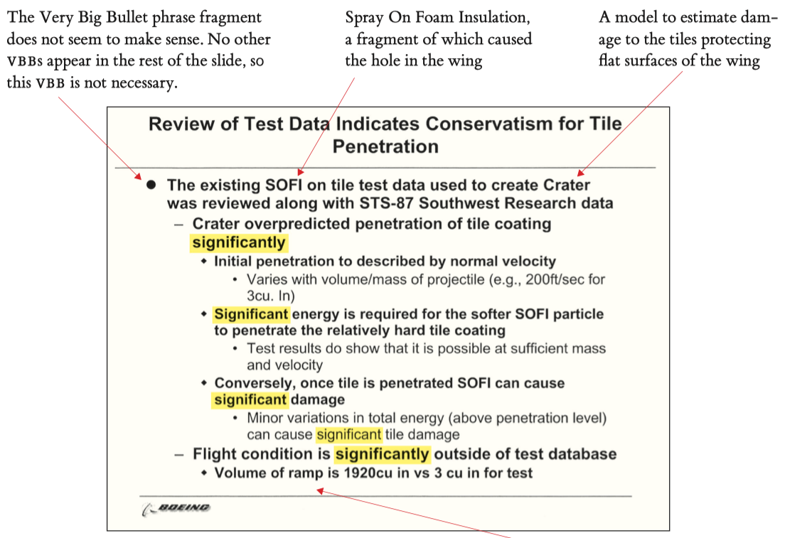
And slides like these, Tufte argued, weren't just the byproduct of bad PowerPoint users, but sprouted from the very ethos of PowerPoint – software designed for marketers to make pitches, and ruinously adapted by a truth-seeking organization like NASA. Indeed, even NASA employees referred to a presentation on aspects of shuttle safety as the "Boeing PowerPoint Pitch". This makes Tufte apoplectic:
This is astonishing language. The WhatPoint Pitch? The PowerWhat Pitch? The PowerPoint What? The language, attitude, and presentation tool of the pitch culture had penetrated throughout the NASA organization, even into the most serious technical work, a real-time engineering analysis of threats to the survival of the shuttle.[2]
In other words, the metaphors implicit in PowerPoint were so powerful that even rocket scientists had forgotten that there were more effective ways to communicate than bullets and slides, and that the real point of communication – everywhere outside of marketing – is not to make a pitch for why you are right, but to present evidence and discuss interpretations.
Tufte's manifesto was an improbable hit. It was excerpted by a Wired article (titled “Is PowerPoint Evil?”), and featured by the New York Times as one of the year’s most impactful ideas. It arguably changed the business culture of some of industry’s elite: years later, Jeff Bezos and Steve Jobs would ban the use of PowerPoint at their companies. The future National Security Advisor General McMaster would call PowerPoint a threat to the United States and bar its use in his operations. He was not alone:
“PowerPoint makes us stupid,” General James Mattis said at the same conference [as McMaster]. And in 2011, a former software engineer in Switzerland formed the Anti PowerPoint Party, a (sort of) real political party devoted to fighting slide-deck tyranny. [3]
It also failed. Tufte had intended to eviscerate PowerPoint, to conclusively demonstrate the ridiculousness of conducting intellectual discourse through slides, bullets, and clip art – and banish it from every avenue of life except marketing departments. Yet, in the proceeding decades, its dominance would only grow, and Tufte's critique would be forgotten by all but the fanatics – and a few readers of a certain Riddler, hopefully now questioning some of their life choices.
Now that the Riddler has chipped away some of your background assumptions, it's time to bring out a metaphor. The PowerPoint is to the old-school speech with handouts as the Graphical User Interface is to the command line.
You see, there's a similarly implicit idea behind the Art of the GUI. A good graphical interface takes some complex operation (editing videos, say) and makes it seem simple. Pretty obvious, right?
But examine this in a slightly different light, and it suddenly seems deeply suspicious. As the writer Neal Stephenson puts it,
By using GUIs all the time we have insensibly bought into a premise that few people would have accepted if it were presented to them bluntly: namely, that hard things can be made easy, and complicated things simple, by putting the right interface on them. In order to understand how bizarre this is, imagine that book reviews were written according to the same values system that we apply to user interfaces: "The writing in this book is marvelously simple-minded and glib; the author glosses over complicated subjects and employs facile generalizations in almost every sentence. Readers rarely have to think, and are spared all of the difficulty and tedium typically involved in reading old-fashioned books."
Except that, as Stephenson continues, we have done this: the novel, once the primary vessel for communicating cultural ideas, has (in his 1990s setting) been supplanted by movies and sitcoms (and later tweets and TikToks).
So what's going on here? Chances are, you were a bit suspicious of the Riddler's exhortations against PowerPoint for the same reason he doubts the full scope of Stephenson's slander: we can think of cases where a PowerPoint seemed like the perfect delivery medium, and a GUI genuinely made a process much easier. Heck, even the Riddler can think of presentations that took some initially confusing algorithm and rendered it perfectly transparent with good graphics and storytelling. And if you've ever tried to edit videos from the command line, or have even tried graphical interfaces for command line tools like git, you know that good visual metaphors can make complex things seem simpler.
But the Riddler would suggest that examples like this can be taken too far. The medium of PowerPoint carries certain visual, highly structured messages quite well, just as the graphical interface excels at certain spatially-oriented applications. Yet both have become so ubiquitous that we've forgotten that there are messages they can't carry. Subtleties, ambiguities, open questions – all have have been sidelined by an implicit faith of the iGen age, the Ethos of the Easy: that not only can "hard things be made easy," but they should be and if they aren't, one has no obligation to suffer the incompetence of its creator.
At this point, while gearing up to deliver his trademark Modern Major General zinger against "kids these days", the Riddler was distracted by a ping. Someone was slacking him.

Ack, his obnoxiously punctual colleague Chester Snuphanuph! The Riddler hadn't finished the slides, but he had reasons – reasons he lobbed back in the form of bullets!
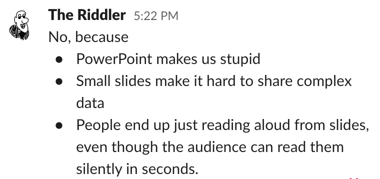
Unfortunately, C. Snuphanuph had bullets of his own.
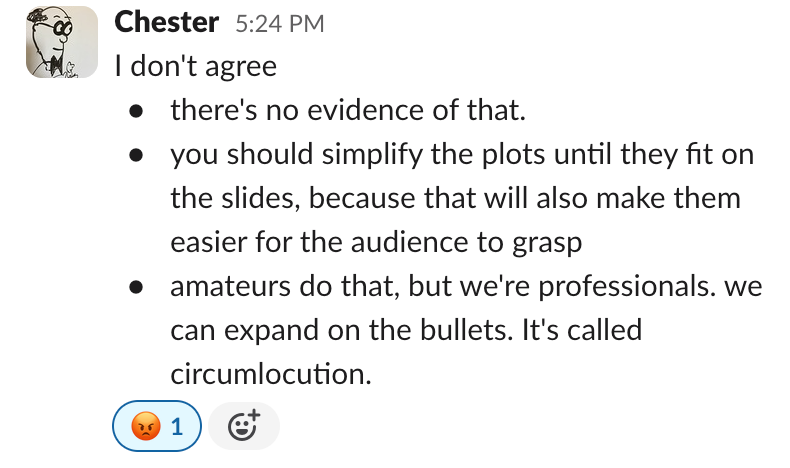
The Riddler had forgotten how hard it is to fight an argument with bullets! He had plenty of them, but for every bullet he launched, another came flying back. Socrates could make people agree with him without professing to hold any beliefs at all - but he, the Riddler, with all of his beliefs laid out with such immaculate structure, couldn't get anything across. It was time to call for help. Fortunately, the Riddler had the number of Edward Tufte, the original sage of the anti-powerpoint party.
The Riddler dialed, and a voice responded. "In a land where time disappeared," it intoned theatrically, "E.T. is not available. Your key to communication is voicemail. Or text message. Do it!" Beep. [Yes, really. 3]
But one of the special powers of being a Riddler is that you can talk to voicemail recordings, and they talk back. "Oh, E.T.-in-the-land-beyond-time," the Riddler said, "help me win my bullet-point war and convince my colleague that PowerPoints are making us stupid."
An ethereal voice floated back. Bullet points? E.T. warbled. They "often serve well for prompts, reminders, outlines, filing, and possibly for quick no-fooling-around messages… a certain convenience derives from their lack of syntactic and intellectual discipline, as each element simply consists of scattered words in fragmented pre-sentence grunts…"
Then E.T. delivered his zinger:
For the naive, bullet lists may create the appearance of hard-headed organized thought. But in the reality of day-to-day practice, the PP cognitive style is faux-analytical, with a bias towards promoting effects without causes…
It is thoughtless and arrogant to replace the sentence as the basic unit for explaining something. Especially as the byproduct of some marketing presentation software.[2]
"But hang on, E.T." the Riddler put in, "I'm talking in Slack. No one sends paragraph-long messages, and if they did, no one else would read them."
Then it hit the Riddler. Slack is much like PowerPoint – a trendy new software-based medium for communicating with an explicit focus on making the sending of messages as easy as possible. One drafts an email; one never drafts a "slack" - most of which are sentence fragments combined with, when more structure is required, outbursts of bullets.
And beneath the cute alert noises, custom emoji, and dancing parrots is the same Ethos of the Easy Stephenson raised arms against. As he might put it: *with Slack, one seldom has to think, and is spared all of the difficulties and tedium of old-fashioned communication!
But at this point, the Riddlers' thoughts of writing a best-seller pamphlet called 'The Cognitive Style of Slack' were interrupted. A third voice had joined the Riddlers and E.T. on the line, and it whispered, 'the medium… the MEDIUM… the medium IS the MESSAGE!'
And the Riddler hung up, shaken, realizing that, not unlike Socrates, he had no idea how much the mediums of PowerPoint or bulleted outlines or Slack really affect normal life; that, outside of the Land Beyond Time, we can't fully know their effects; and that becoming overly obsessed with mediums and messages is a good way to drive oneself mad.
After venturing down these same roads (including hearing the same voicemail message from Edward Tufte), the Atlantic writer Ben Kothe lamented that all of this moral panic had been directed at PowerPoint, instead of the (in retrospect) much more problematic areas of social media, surveillance capitalism, or generally diminishing attention spans. The next twenty years would give us plenty more pressing concerns than badly-made slides.
But beneath all of these is what the Riddler thinks of as the “meta-story” of the early Information Age. After centuries of communicating through fixed mediums like conversations and stacks of paper, digital technology gave us the means to rapidly invent new mediums of communication: webpages, texts, tweets, podcasts, ‘snapchats’ – and yes, PowerPoints. The early modern wave of technological criticism (1980s-2010s) tried to reckon with the societal and psychological effects of these new mediums. This included Neil Postman’s missive against television, Amusing Ourselves to Death (1984); Nicholas Carr’s The Shallows (2010); Tristan Harris’s early user interface critiques for the Center for Humane Technology (~2018); and, of course, Tufte’s Cognitive Style of PowerPoint.
In retrospect, all of these failed.
But to understand why, Tufte’s pamphlet might be the perfect exemplar. It has an evidence-backed complaint against a specific medium, and proposes a concrete alternative. It doesn’t overindulge in wooly proclamations (e.g. that “the medium is the message”); but it does have wit and verve. It even connects the subject of its attack to a well-publicized disaster, the 2003 crash of the Columbia space shuttle. Unlike the criticism to follow (Carr’s broadsides against the Internet, or Harris’ against social media), dropping PowerPoint was immediately feasible. Tufte even spelled out his preferred alternative:
What to do? For serious presentations, it will be useful to replace PowerPoint slides with paper handouts showing words, numbers, data graphics, images together. High-resolution handouts allow viewers to contextualize, compare, narrate, and recast evidence. In contrast, data- thin, forgetful displays tend to make audiences ignorant and passive, and also to diminish the credibility of the presenter. Thin visual content prompts suspicions: “What are they leaving out? Is that all they know? Does the speaker think we’re stupid?” “What are they hiding?"...
Of course full-screen projected images and videos are necessary; that is the one harmless use of PP. ==Meetings should center on concisely written reports on paper, not fragmented bulleted talking points projected up on the wall.== A good model for the technical report is a scientific paper or commentary on a paper published in substantial scientific journals such as Nature or Science.[2]
The reaction to Tufte was two-fold. A privileged minority of people like Jeff Bezos, with the personality and personal resources to question conventional wisdom, implemented Tufte's advice near verbatim (and, to this day, Amazon's most important meetings center around written handouts – a practice its employees love). Meanwhile, however, those without the time to question their society's default mediums continued to make slide decks and give and sit in talks which, if Tufte is at all right, are wasting huge amounts of their time.
Something about this pattern feels familiar to the Riddler... it reminds him of the lucky few who can pay for minimally-processed organic food, or in this case, to escape privacy-invading search engines or operating systems – who buy Lightphones, and, God help us, E-ink tablets. If you've read this far, you're probably a part of this privileged Attentional Elite – and there's a good chance you want to be a "serious presenter" badly enough to start giving Tufte-style presentations.
So by all means. Spread the good news. Spread it as far as you can, because the Riddler has been yelling since the time of Gilbert and Sullivan, and his voice is getting hoarse.
Fortnightly Riddles
Johnnie's evil math teacher gives each member of his hundred-strong class a transparent card with a number, styled like the seven-segment display of an old clock, ranging from 1 to 100. He then asks the class to find the sum of their cards. Someone shouts "5050," and the evil math teacher smiles maliciously and says "That's one sum!"
What's the range of them all?
Solve it? Post your answer as a comment to this newsletter to claim credit : )
Solutions to previous riddles:
Last week we wondered what problem generalizes the most-expressive-weights problem (which is answered by powers of 3) to powers of 4.
First, we might consider why powers of three are meaningful. For each weight, we have two places it could go – plus the option not to use it; thus each weight can be in one of three states. We're essentially created a numeral system with weights instead of digits
So, if we want to create a similar problem for powers of four, we just have to add an extra dimension. Here's one possibility:
Severus has a set of tinker-toys, with n sticks of various lengths that can be joined at right angles in 3d space: either up, down, or across. He also has a piece of string which he can attach from the base of the tinker-toy structure to the point furthest from it. Now, Severus, being a tricky little fella, says that he wants the right lengths of tinkertoys to maximize the unique lengths he can measure with his piece of string. How can he do it?
This isn't the most elegant, since we no longer get integer multiples. Perhaps you can find something better.

